Which country do most migrants come from? How many are there worldwide? And how much money do these migrants send back to their home countries? The answers to these and other questions have been processed in an informative graphic by e-politik.de.
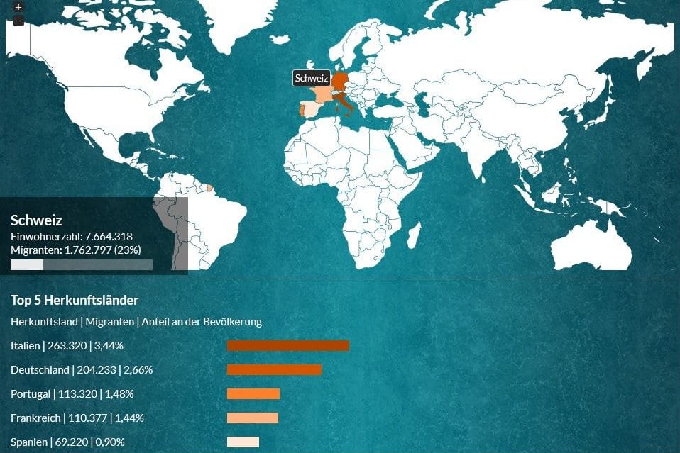
The e-politik.de association has created an interactive infographic on the topic of migration. At the center of the infographic is an interactive world map on which data on the topic of migration can be called up for all countries: Total population, proportion of migrants and origin of migrants.
In addition, further information on the topic of migration and key topics such as elite migration, flight and displacement or urbanization can be read via the navigation bar at the bottom.
Misconceptions about migration
The topic of migration leaves very few people indifferent. Nevertheless, the public debate is characterized by a lack of knowledge and misconceptions. Graphics such as this one and, for example, our online journey of discovery Migrationsflut und andere Märchen (Migration flood and other fairy tales) are intended to make the migration debate more objective.
Migrationsflut und andere Märchen (Migration flood and other fairy tales) dispels the five most common misconceptions. You can start this journey at www.migrationsflut.ch. (this website is no longer available, note 22.8.2019)
Graphic almost freely available
The infographic from e-politik.ch is licensed as Creative Commons and can be used and redistributed free of charge by anyone for non-commercial purposes. It can also be easily embedded in websites and blogs using an embed code.